Documentation
Through experimentation with fluidity and randomness in unit 2, I realized that the role of the ‘subject’ is constantly changing. Ultimately, I understand that the forces shaping matter and controlling our existence may stem from the interplay of those elusive, tiny beings that constitute us and the void of space. In my next practice, I hope to further diminish the subjectivity of 'me,' transferring it to other people or to non-human technologies of consciousness.
In this section, I document different experiments with transformation of subjects and the MA show. These various subjects can be broadly divided into three categories: the 'personal subject,' which explores emptiness within the printmaking medium; the 'other subject,' which transforms specific objects beyond conventional thinking; and the 'non-human subject,' represented by artificial intelligence's recreation of theoretical understanding.
Non-human subject:
artificial intelligence's recreation of theoretical understanding
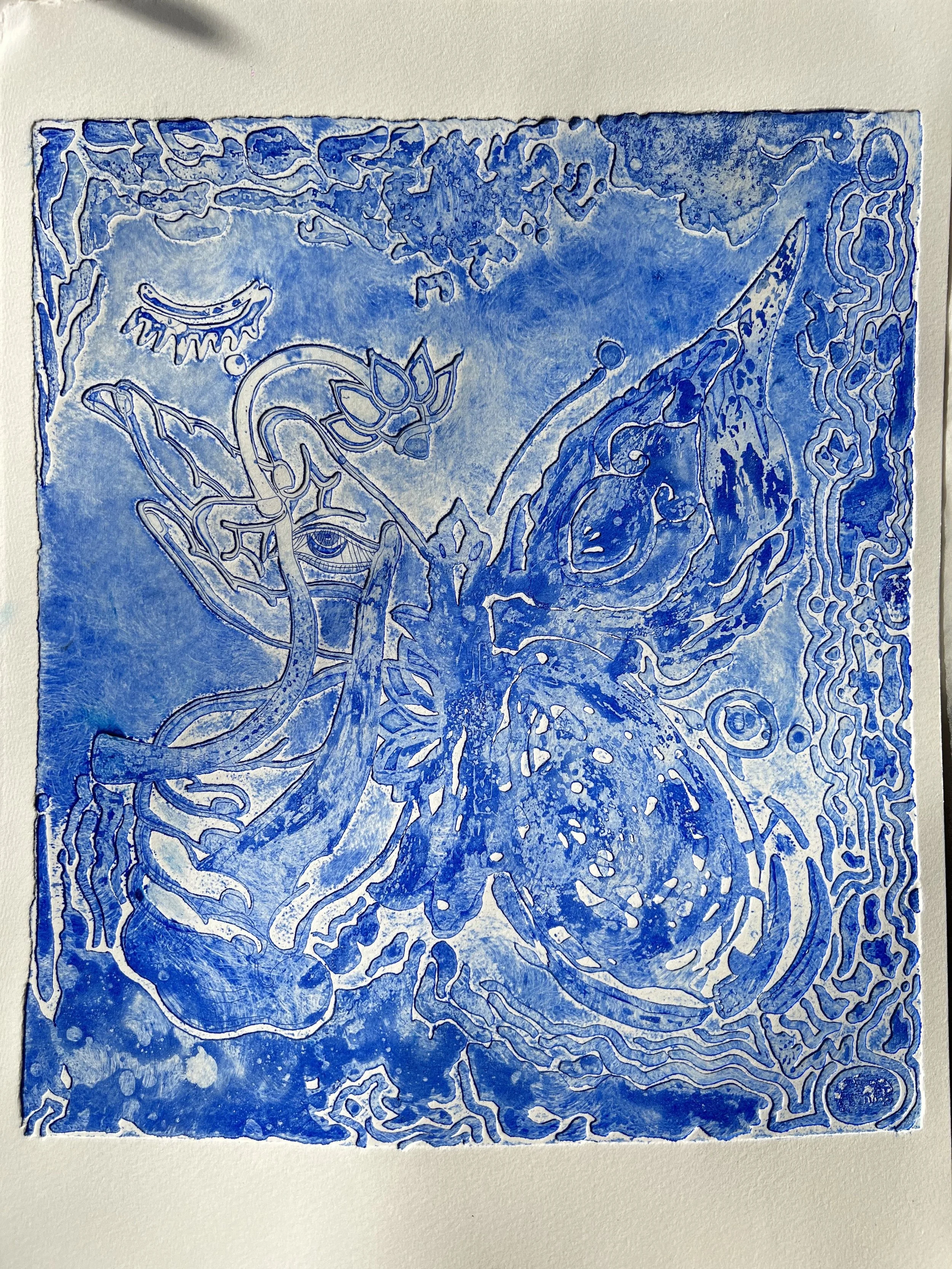
At the end of the last unit, I shifted my focus from ‘dependent origination’ to AI’s transformation of my inquiries in order to explore new subjectivities. The content I input included keywords related to emptiness and images of my printmaking works, aiming to elicit a visual response from AI regarding its understanding of emptiness and fluidity. The resulting video answers were somewhat unexpected, visually transcending the two-dimensional plane. I am uncertain whether this is an illusion, but this generative experiment seems to give birth to a three-dimensional state of life from the so-called 'emptiness,' continuously arising from it and constantly flowing and changing.
I processed the generated images in Photoshop into two versions, one with strong contrast and the other with weak contrast, hoping to compare the printing effects in lithography. When deciding on the dots to print on film paper, I immediately chose stochastic dots to preserve a sense of visual freshness as much as possible. I’m glad I made the right choice: when the image is printed on paper, it minimizes both man-made and mechanical effects, resulting in a more ethereal existence.
AI generated video, input picture is my print work Being#1
dots comparison before images printed to film paper

film printing process

compare two films by exposing them at the same time

cleaning photo litho plate

strong contrast image printing effect on rice paper

weak contrast image print effect with same ink
The ‘Personal subject’:
explores emptiness within the printmaking medium
Asphalt powder and the abstract expressionism within Ten breaths
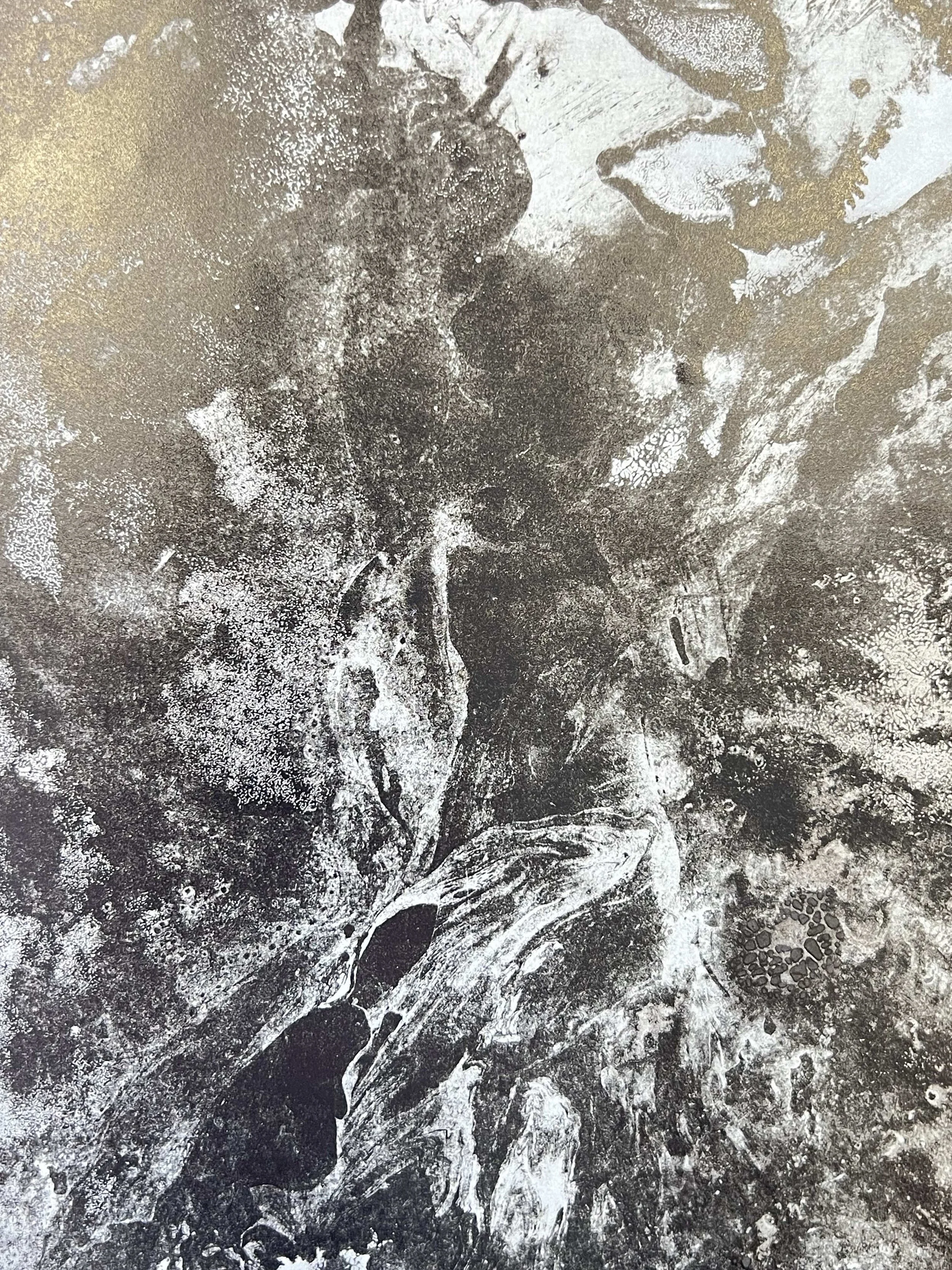
After discovering the unique qualities of asphalt powder (you don't know which areas will suddenly disappear, nor how many new traces will emerge as it is gradually printed), I decided to continue using it to create subjective transformations. I established some rules for the creative process to reduce my subjective awareness:
1) The materials used are limited to asphalt powder and flowing mediums;
2) The three zinc plates will be used alternately, employing the same medium each time;
3) Each artwork should be completed within the time it takes for 10 breaths, from start to finish.
I chose to work on three zinc plates simultaneously, intending to disperse my mental focus away from any particular piece. Meanwhile, the rule of limiting the number of breaths intensified the dissolution of my subjective consciousness. Even when I desperately wanted to refine certain areas, the feeling of suffocation forced me to stop my work earlier than planned. The process approached chaos during the final few breaths, evident in the large areas of mixed paint and the ferocious smears in my images. The lack of oxygen in my brain accelerated my creation, diminishing my control over most concrete details, resulting in this body of work losing its previous delicacy and freshness, while instead gaining many primitive, powerful, and even animalistic traces.

preparation: Zinc plate x3, water, ink, white spirit, asphalt powder

traces of ink left over the course of 10 breaths

avoid using a rag to prevent the asphalt powder from being wiped by the gum, leaving a thicker gum seal

the mixing of the gum with a variety of pigments appears to have created a chemical reaction, forming a new color

the effect of wetting the zinc plate with water during the process of printing ink

first print of Being#12

first print of Being#11

first print of Being#10

close up of Being#11
close up of Being#12

close up of Being#12

MA show review


MA Show 2024
From the initial proposal for the MA exhibition to the subsequent plans and practices, the design underwent at least three major revisions. The original proposal was centered around the idea of big data remixing my original prints, where video projections were displayed on silk constantly blown by a fan, creating an installation that intuitively represented fluidity and impermanence. While the professors saw it as an exciting and challenging innovation, they suggested that I could experiment and refine it over a longer period. They recommended that, for now, I focus on already completed works that were more effective, such as the lithography pieces from the series I had already developed.
Then I began searching for current sources of inspiration and found the key concept of "self-observation." I wanted to approach this through the materiality of the creative medium, aiming to create something akin to Nam June Paik's TV Buddha—a self-contained, meditative gaze. The two parties in this gaze would be the lithographs created with asphalt powder and their original form—simply a pile of asphalt powder. To explore this idea, I conducted experiments using flour to simulate asphalt powder, preserving its natural state while infusing the form with some visual Zen qualities. At the same time, I decided to create a series of works that would be more in tune with a meditative creative process. This led to the "Ten Breaths with Asphalt Powder" experiment, which, while not as tranquil as meditation itself, took me to a place I would not normally have reached.
During the hanging experiments with Peter, I compared different suspension methods, aiming to achieve the maximum translucency for the pieces while avoiding any damage to the rice paper. I also learned from Greg the technique of using seed glue to stitch the rice paper together, minimizing the overlapping sections. I was fortunate to have conducted extensive learning and testing in the early stages, which helped me make better decisions when faced with changing directions, eliminating inappropriate methods and shifting approaches.
The second major change in the plan occurred shortly before the exhibition when I was informed that due to the toxic nature of asphalt powder, it could not be presented as an individual exhibit. As a result, the concept of mutual gazing between the asphalt powder pile and the lithographs was rejected, and I had to devise and present a new plan within a week and a half. I shifted my approach, changing the appearance of the asphalt powder from its original powder form to becoming part of the rice paper scroll. I immediately tested this new idea. Skipping the printmaking and lithography processes, the asphalt powder on rice paper created a very primitive, ink wash-like layering effect. The medium white spirit dried quickly, allowing the powder to be absorbed faster than ink. After completing the 12 lithographs, I cut rice paper to match the length of the prints and used it to hold the asphalt powder. I occupied the longest table in the printmaking studio for an entire afternoon to create a 7.4-meter-long scroll where the only coloring medium was asphalt.
In the design of this exhibition, I shifted the focus to the Taoist philosophical concept of "One gives birth to Two, Two gives birth to Three, and Three gives birth to all things," and based the structure of the work on this idea. The first scroll features the calligraphic phrase "Tian Xin" (the "Heart of Heaven"), printed through silk-screening, representing the center of the universe and, by extension, the core logic behind all things. The rest of the scroll remains blank, symbolizing the primordial "One"—the original emptiness, the formless state where all possibilities are latent. The second scroll was created using an asphalt medium, directly applied to the surface. This scroll evokes the chaotic state at the beginning of the universe, reflecting the Taoist idea of chaos as the raw, undifferentiated potential from which everything arises. The material's accumulation and flow represent the transformation from nothingness into somethingness—an embodiment of emptiness in its most materialized form, before all things took shape. The third scroll is composed of 12 lithographs, created through a process of random experimentation. These prints are stitched together to represent the proliferation and emergence of all things. The images can take any form, symbolizing the constant generation and transformation of life and matter in the universe. This scroll captures the ongoing birth and unfolding of creation. Together, these three scrolls illustrate the evolution from emptiness to the material world, reflecting the philosophy of emptiness: Emptiness is not a void but a wellspring of potential. All forms and existence emerge from emptiness, and ultimately, everything returns to it.
During the final stages of installation testing and exhibition setup, my work underwent its final adjustments and changes. Due to the limited space allocated to each artist, we adhered to the principle of "less is more." As a result, I decided to remove the scrolls of rice paper that originally featured both calligraphy and empty spaces from the final display. Instead, I cut out the sections with the calligraphic text and integrated them into the stitched scrolls, as if the text had fallen out from within.
In addition, since the height of the wall space assigned to me was limited and we were not allowed to suspend anything from the ceiling, Jo Love suggested I create iron frame structures to give the scrolls a sense of undulation. Building on earlier translucency tests of the rice paper and suspension experiments, I chose 6mm diameter steel pipes as the material for the frames, ensuring the length of the pipes was shorter than the width of the rice paper to minimize the presence of the frames themselves. With the guidance and help of Daniel Boyle, I successfully created two of the most minimalist and stable iron frame structures in the entire design.
During the exhibition, this piece received much praise, including compliments on its grandeur and visual impact. The brownish hue of the asphalt seemed like a color without inherent qualities, evoking a sense of balance and naturalness. Additionally, the lithographic images, seemingly emerging from the void, sparked curiosity in the audience, prompting them to engage with and recognize the images. Through this installation, the work found a subtle balance between the ethereal and the present, breaking the traditional boundaries between "form" and "emptiness." It triggered deeper reflections on the self, materiality, and emptiness.
the initial design: includes printmaking and three-dimensional installations
Nam June Paik – TV Buddha, 1974/2002, Statue of Buddha, TV monitor, closed-circuit camera, color, silent, dimensions variable, collection of the Nam June Paik Art Center
the process of creating the long scroll with asphalt powder

the revised design: confrontation between asphalt powder and printmaking works

experiment using flour to replace asphalt powder (top-down view)

experiment using flour to replace asphalt powder (frontal view)

selecting and testing different methods of hanging rice paper

the most secure method

translucency test

attempting to hide the wood in the hanging method

roll up the rice paper with a cylindrical stick

asphalt powder color matching experiment

successfully found the color closest to asphalt powder

the ink plate reminds me of Mark Rothko

the printing effect

the effect on rice paper creates a sense of depth in the composition

adjust the order of the works

seeds glue before water is added

Greg is demonstrating how to paste the rice paper

Heating the glue and flattening the rice paper, the gluing process took the entire day

preliminary asphalt powder experiment on rice paper
preparation before creating the 7-meter rice paper artwork

completed asphalt powder creation, air-drying on glass

design sketches of the metal frame

searching for suitable materials in the sculpture workshop

the metal strips I cut myself, ready to be welded

exhibition setup

design sketches for different hanging methods of the scrolls

final placement angle and presentation length determined

the great exhibition team, successfully raised the wall height with wooden boards

thanks to the teachers for their help in allowing the artwork’s height to surpass the wall limitations

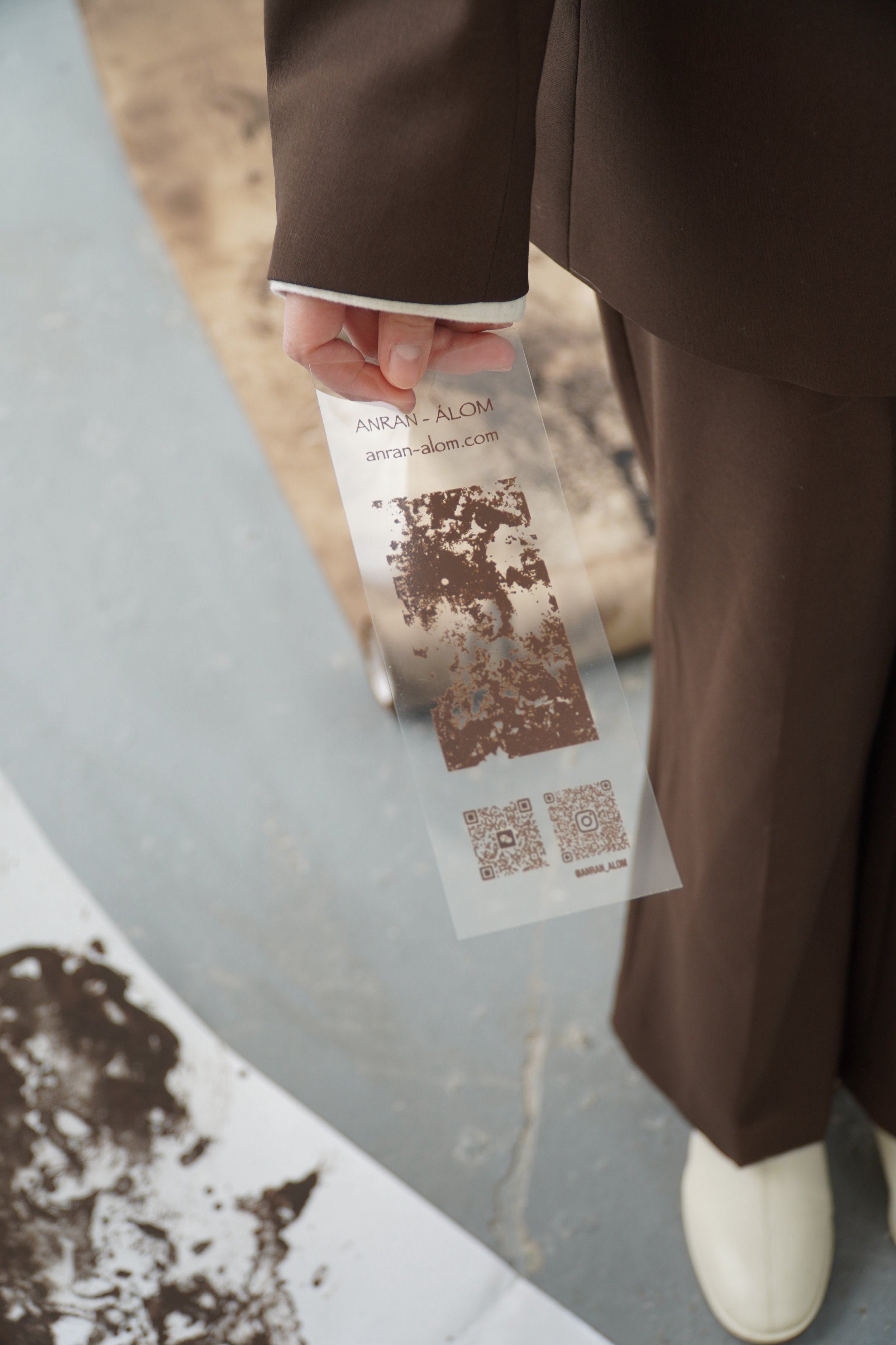
the screen of calligraphy text and personal business card in the exhibition

finished business card: screen print on acetate, echoing the theme of emptiness

scene near the end of the exhibition setup day

the perspective of the artwork within the entire exhibition space
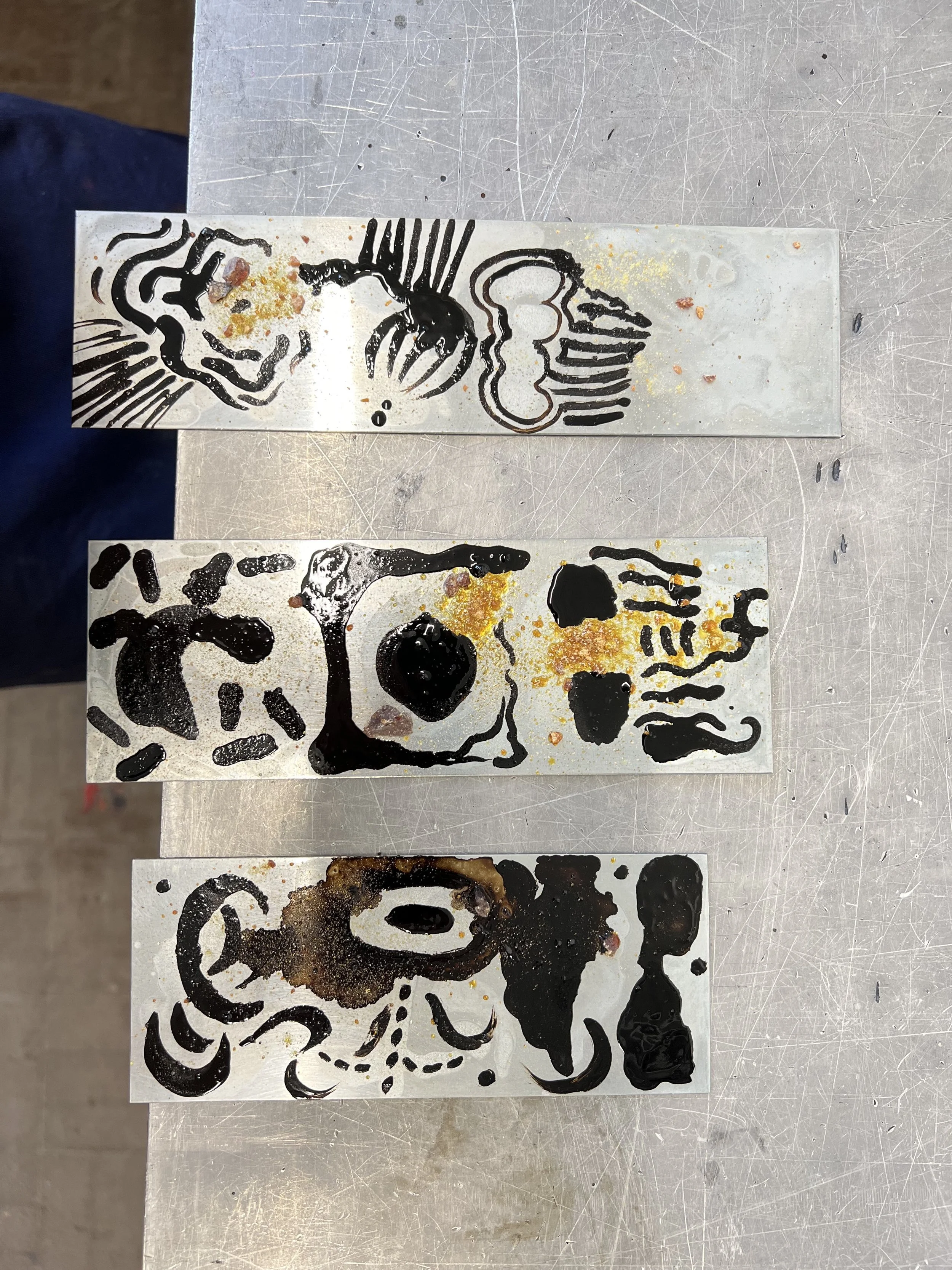
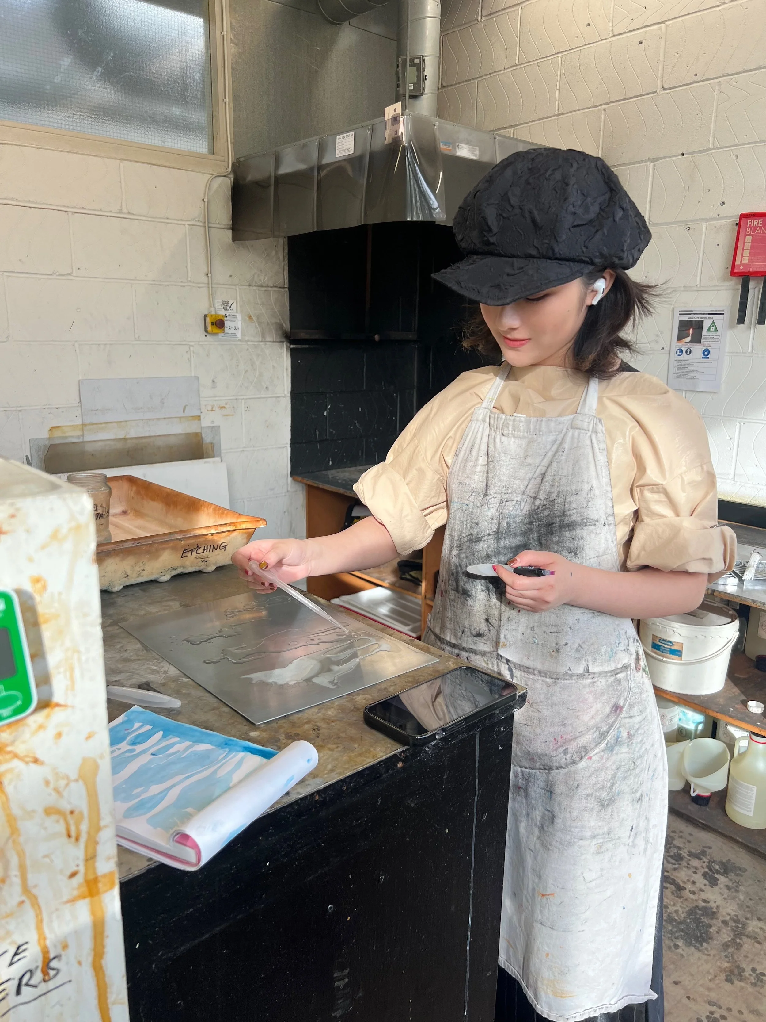
Technique experiments in etching workshop: Aquatint, Spit bite, Deep etch and Color testing
In the etching workshop, I aim to explore the random effects of acid under various variables within the etching technique, seeking a balance between different etching methods through their layering on metal plates. My goal is to identify a relatively controllable approach, which can then be applied in my creative work beyond experimentation. This exploration also involves investigating the visual presentation of printmaking images in connection with the materiality of the print medium itself.
I focused my experiments on the highly random spit bite technique, drawing inspiration from Anish Kapoor's etching series Breath Blue(2020). I am eager to understand how this technique, which produces both a deep, intense yet ethereal corrosive effect, is achieved. After reflecting on my questions and discussing them with Brian Hodgson, I divided the experiment into two primary aspects: the way acid corrodes in the process, and the contrast of colors.

first time spit bite

experimental effects of acid

complete aquatint
the first layer

the second layer

the third layer


On three small metal plates, I sequentially employed dusting, spit bite, and a subsequent round of spit bite using a more granular Riso print, followed by three times of Rhinds varnish in an open bite process. My primary focus was on exploring the flow effects of acid on the metal plate, posing the question: how can this strong corrosive medium be used to produce a blurred, profound effect? The experiments demonstrated that acid is not the first medium to contact the plate; instead, the true manifestation of the gradual, flowing effect comes from the acid's diffusion and movement in water, which is then fixed in place. After nine different sequence trials with these two mediums, I gradually grasped the flow patterns and the necessary conditions for achieving them. This process directly led to the creation of my etching work The Dusk. (below)
In my exploration of color, I found that cool tones were more effective at enhancing the ethereal and profound atmosphere I sought, compared to the vibrant energy of warm colors. Additionally, a mix of yellow-green tones revealed a primitive, natural materiality in its visual effect. As Brian observed:upon seeing the piece, one might not immediately think of a print, but rather the original appearance of a metal plate after natural corrosion. I found this observation intriguing, as it aligns with my work in lithography, where I used asphalt colors to depict traces of asphalt powder in a form that reflects the "presence" of a material in a seemingly "absent" way. At the same time, I continued to explore these colors in the creation of my new work The Dusk, in order to achieve the desired effect.


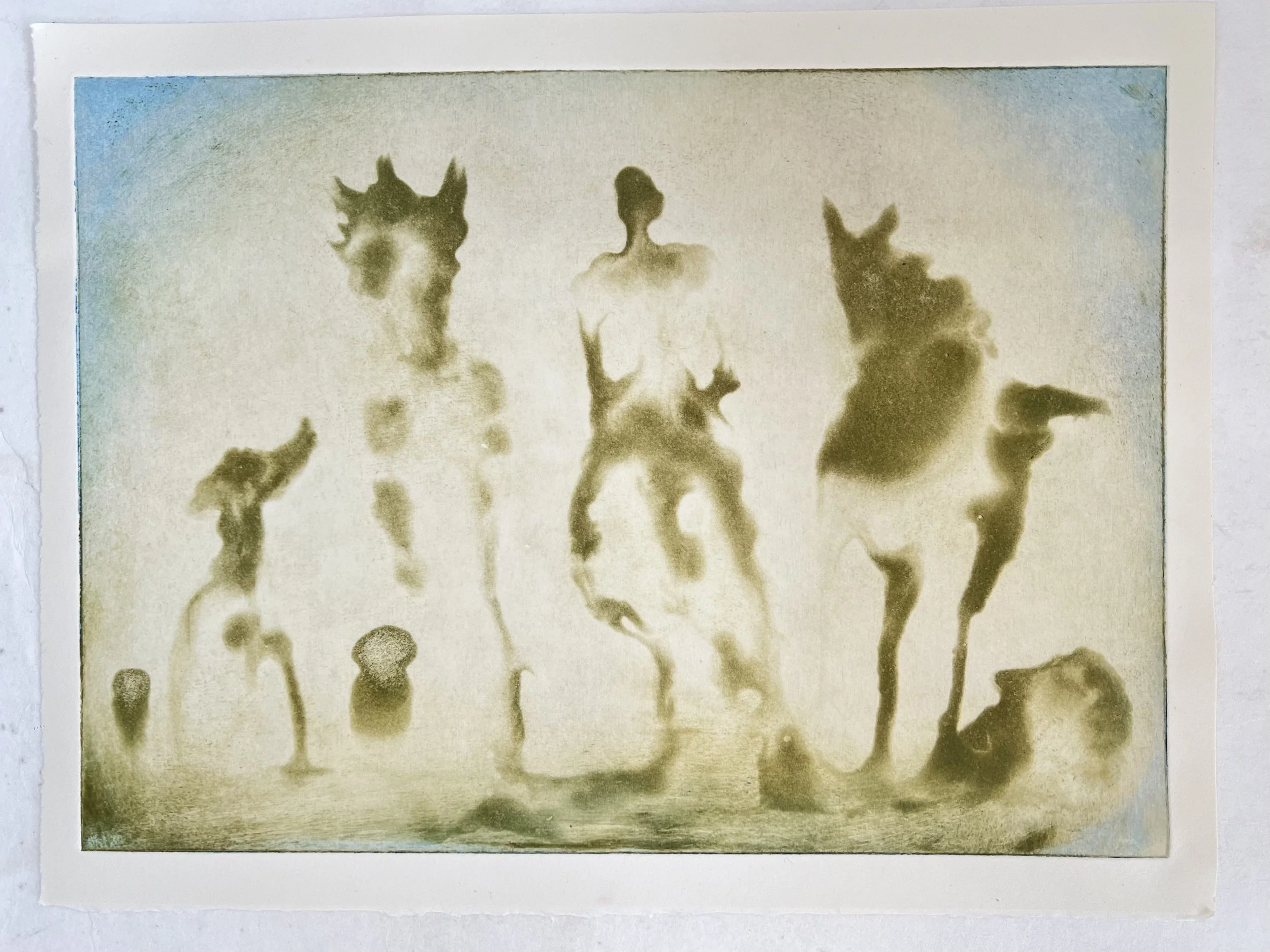


This plate(below) is a piece that has been in progress since the first unit. It has undergone various processes, including aquatint, sugar lift, spit bite, and hard ground etching. I hope it can convey a sense of spirituality and sublimity, similar to the moment of Siddhartha's enlightenment by the river, yet I have never been fully satisfied with its final presentation. After a series of etching experiments, I feel I now have the ability to improve it. The inspiration I gained from these experiments led me to revisit this plate, adding new layers of creation. Although the original pattern was full of randomness, as an artwork, it lacked a sense of cohesion and depth. The open bite technique seemed to offer a way to preserve the original randomness while also emphasizing the main subject of the image, enhancing the overall sense of order in the work. I used Rhinds varnish to seal the areas I wanted to retain, while also using it as a medium for creating new patterns. This process was quite intriguing, almost like creating a relief print on metal. I used my fingerprint to leave a varnish pattern, curious to see the result after the open bite process.
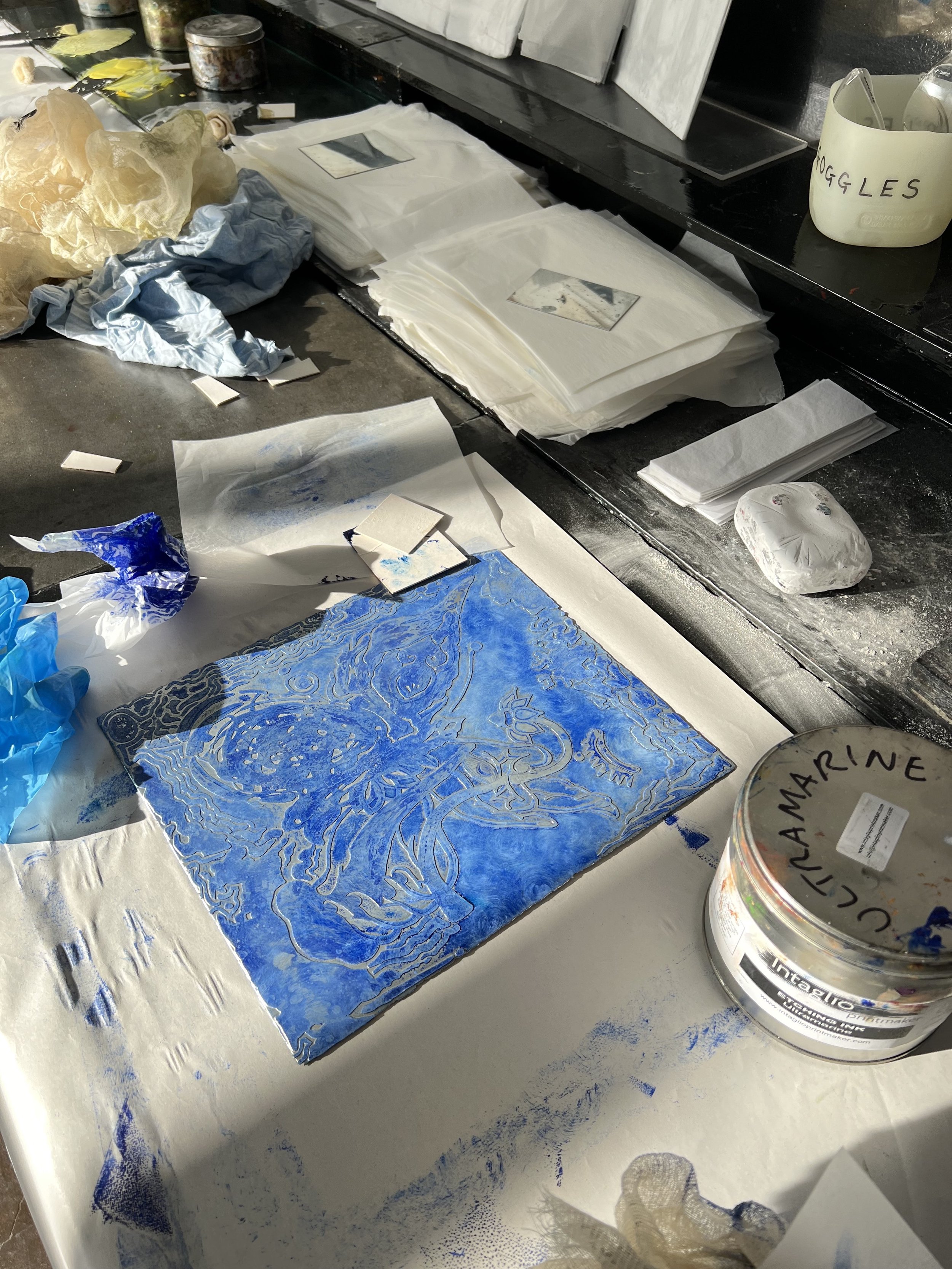
The etched plate exhibits a peculiar sculptural quality. I experimented with using a roller to apply ink, aiming for a relatively clean background, while mixing a small amount of white ink on gauze to reduce the flatness of the color and achieve a deeper effect. The relief-like textures and the blurred background seemed to accomplish this, with the pattern appearing to emerge from a flowing blue, reminiscent of the ocean or sky. I reduced the ink used during printing, which allowed the image to reveal more intricate details, and I also attempted a ghost print. An intriguing discovery was that when I adjusted the tonal values of the printed image to a gray-white, the result on the paper took on a texture similar to that of the plate itself—like a glossy silver relief, where the material (the metal plate) manifested its existence in a form that was not immediately visible (the artwork itself). From a material perspective, this seems to reaffirm the concept that things invisible to the naked eye are not "nonexistent," but rather exist in a different, perhaps hidden, form that serves as their vessel of existence.

preparing materials

using a fingerprint to apply Rhinds varnish

etching process - close up

after the first etching, I applied a second layer of varnish

the pattern began to emerge

complete etching

clean off the varnish layer

like a relief printing metal plate
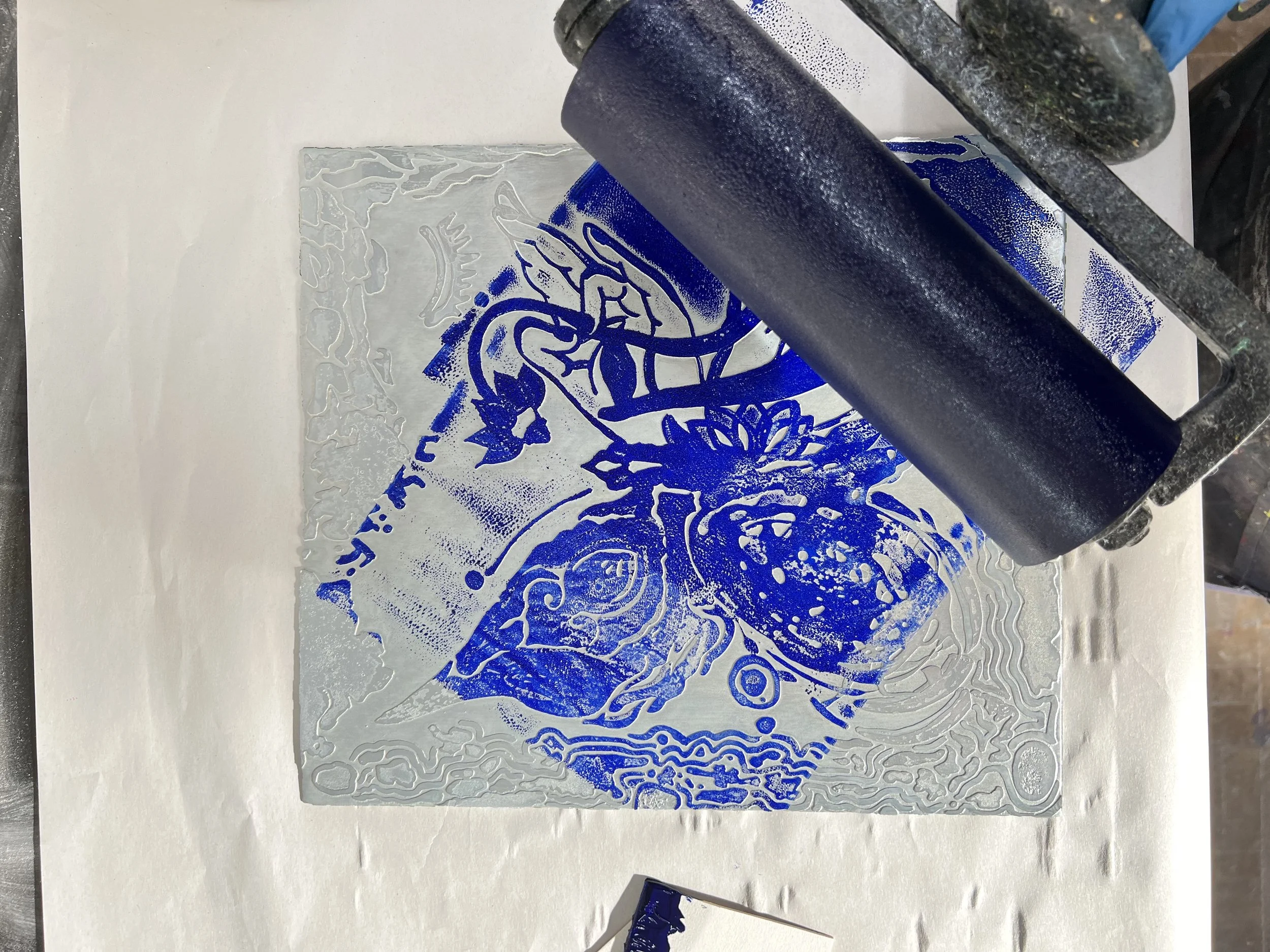
apply ink with roller
coloring complete

first print
the texture on the paper is visible

second print

after reducing the amount of ink, more details appeared

close up I

close up II

treated image to low saturation, like the metal plate itself

attempt at a ghost print
The 'other subject’:
transforms specific objects beyond conventional thinking
The idea of an experiment with the "Other" as the subject conjured many forms in my mind, but the true realization of this experiment came from the inspiration I gained in the summer of 2024, when I saw high school students doodling on their desks. These are traces I observed on high school students’ desks(right picture)—many interesting patterns and words. From these, I could sense the richness of their imagination, their pure inner thoughts, and their strong self-awareness. At that moment, I realized that this group of students were highly creative "Other subjects." At the same time, from their desk doodles, I could sense that they perhaps also longed for certain aspects of themselves to "be seen."
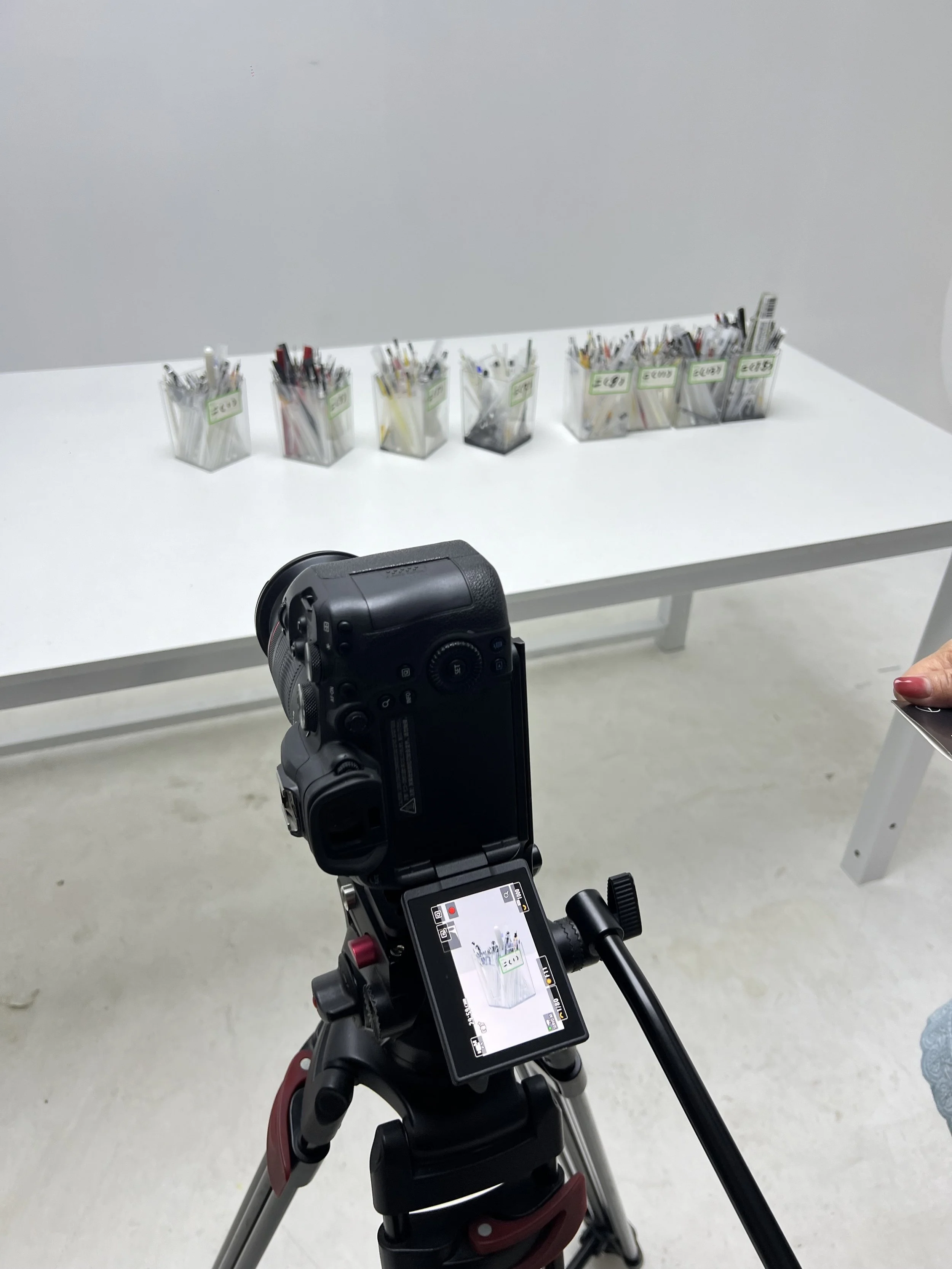
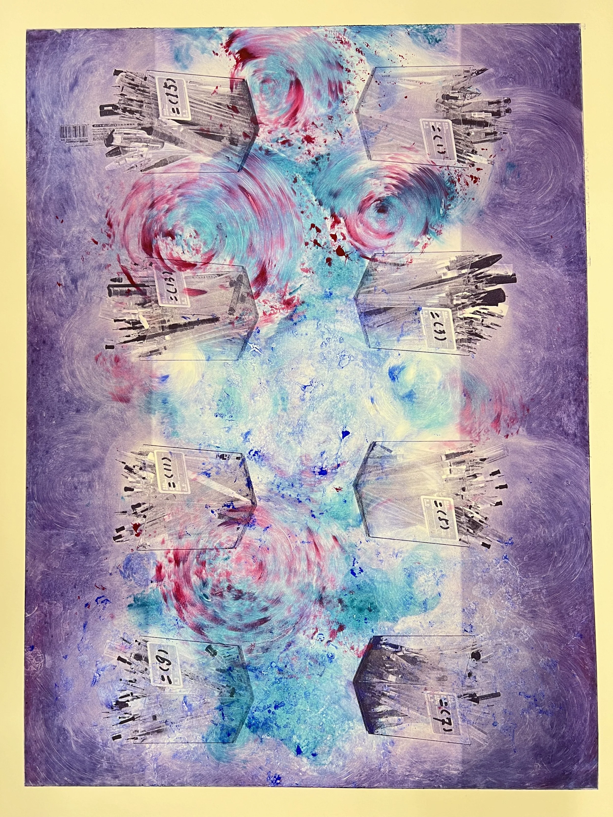
In order to minimize the impact on high school students' daily studies, I chose the simplest and most familiar medium to conduct this experiment—the empty pen refills. When I was in high school, I had a little habit of collecting used pen refills, which I would photograph and record at the end of each semester as a form of evidence and achievement for my diligent studies. This experiment is one that is constructed and dominated by the "Other," and collecting the materials was the first step. I described the art project I wanted to explore to the high school teachers and distributed empty pen containers to various classes, asking each class leader to help collect the empty pen refills consumed by their class over a ten-day period. This experiment received far more support than I had anticipated: each class filled a whole container with pen refills, and some classes even carefully arranged the direction of the pen refills, while others also included the used pens. I didn’t move them at all but instead preserved their original state and immediately recorded them.
I tried three different approaches to conduct this experiment in order to compare and explore the deeper meanings behind the behavior. The first approach is from the objective perspective of "seeing." I chose to use photography to document the state of the pen containers filled with empty pen refills. Each container was photographed individually, as if it were a fine piece of art. I then moved the containers to different locations and changed the angles of the shots to create new observation points and different narratives. These discarded pen refills, along with the pen containers that were never part of the high school daily routine, were now emerging from "nothing," becoming traces and material carriers of the invisible. The space-time of the used pen leads, too, became a perceived existence through the photographic documentation of the empty pen leads. Both the "emptiness" and the "fullness" of the pen refills were seen together.
Some of the text content on the desktop:"People experience joy and sorrow, parting and reunion. I can mend and patch things up." "By the forest and spring, I cross the water; the white clouds drift and scatter." "Is freedom beyond the sea?" Another child adds: "Beyond the sea is the enemy."
Record of the process of collecting pen refills from the classroom


Workshop Process Documentation - 2’26 (Filmed by Anran)
I designed a workshop composed solely of these collected pen refills and sheets of paper, inviting children from elementary to high school to participate. These pen refills are tools they are very familiar with, as they use them daily for writing and solving problems. At the same time, the simplicity of the materials allows for a more intuitive and swift completion of an “others-centered” experiment. Having gone through the same age stage as these children, I know that after repeated use of a pen for its singular purpose, we tend to subconsciously assume that the empty refill's predetermined fate is to be discarded. It is precisely because the refill is considered empty (even though some still intermittently release ink) that we are able to reassess it and explore what more it has to offer. For this workshop, I established very simple rules: the only materials allowed are tracing paper and empty pen refills, and the starting point is encapsulated in one sentence: You have absolute freedom in the use of these two materials, what do you most want to use them for?
The video(above) and the images(below) are the feedbacks I received during the workshop, and they completely took me by surprise. Some of the paper was crumpled and then unfolded, repeatedly crumpled and torn; some paper were filled with dense numbers, which were then punctured with the refills. There were also children who played darts with each other's papers. During this process, I tried my best not to intervene or ask about the origins of their images; instead, Everything that happens is accepted. Maybe in this way they can come closer to emerging from ‘emptiness’.This entire process made me realize that the so-called "emptiness" is not a void devoid of meaning, but rather a starting point full of infinite possibilities. Beginning with "emptiness" does not imply that there is nothing, but rather that all possibilities are waiting to be discovered. Just like the marks and traces left by these children on the paper, each action reflects their interaction with the materials and space, imbuing the objects with new meanings and a sense of existence. There are no preconceived expectations, only pure exploration and experimentation. Perhaps, in a sense, the true freedom of emptiness lies in its limitless potential. It is within this unbounded state that we are able to discover, deconstruct, and rebuild, allowing ourselves to cultivate new awareness in the process.


Facing the feedback works from the children in the workshop, I made an effort to avoid evaluating or judging them. Instead, I brought the insights and inspirations from this process into the third perspective of the experiment—printmaking. I chose photopolymer because it not only preserves the original details of the image to the greatest extent but also allows for the layering of subjective consciousness during both the image processing and printmaking stages. Photopolymer has a unique advantage in that it can faithfully reproduce the initial image while also incorporating new creative perspectives through post-processing, making it an ideal medium.
My intention was to treat this creation as a work that traverses the boundaries between "self" and "other," rather than simply treating it as an object to be observed from an external perspective. In this process, I responded to the perspectives established in the first two creations, and I also hoped to re-integrate the seemingly independent elements through the medium of printmaking, creating new meanings and layers.
During the image processing, I quietly removed the red of the pen refill and the green class label on the pen barrel. I also changed the orientation of the pen barrel, making it appear upside down from any angle. This series of changes symbolizes the need to break conventional thinking in order to re-examine the image. The red pen refill is typically associated with correcting assignments and marking errors. By removing the red, I not only eliminated the distinction between right and wrong but also discarded the framework of critique and judgment. This change was not only visual but also a challenge to our way of thinking: without the "red" refill, there is no longer a simple dichotomy of right and wrong; instead, there is an open space that allows for multiple interpretations and possibilities.
Upon closer inspection, you’ll notice that the label with class information is actually a medical prescription note, with different class numbers listed in the ingredients section, while the other sections like "description," "indication," and "dosage" are left blank. This detail hints at the possibility of rethinking our inherent definitions of "labels" and "identities." By removing the original "healing" implication from the label, I also suggest that we no longer solely rely on external markers to define the value of individual and group behaviors. In the changes and reconstruction of the image, I used the transformation of objects and symbols to step away from conventional frameworks of thought, re-examining the evaluation standards we habitually follow. At this point, emptiness has become a perspective: whether it’s the pen refill, the label, or any seemingly habitual state, all have the potential to break free from their original function and meaning, becoming new forms of existence and modes of expression.

making color adjustments and conducting tonal tests

picking up the printed film from Hexio

checking the print quality of the film

trimmed to the size suitable for the plate

exposure process

preparation before cleaning the plate

adjusting to the appropriate water temperature

the plate pattern is clear, with no bubbles caused by dust

drying for 15 minutes

the effect after applying the ink

the first print


Color Experiment 1

Color Experiment 2


Color Experiment 3

close up